Chart Vizzard
Vizzlo's AI-based chart generator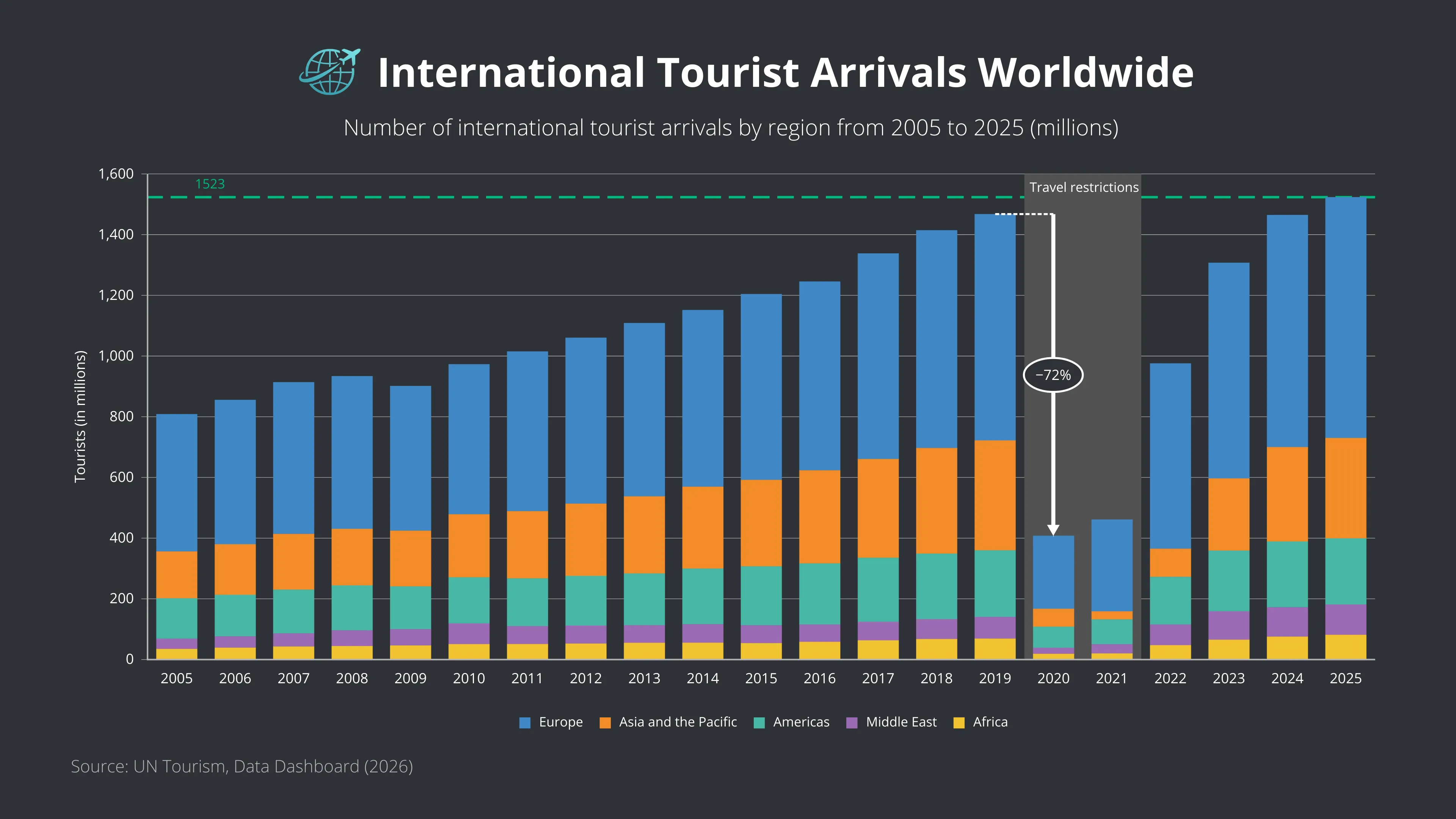
International Tourist Arrivals Worldwide
This stacked bar chart illustrates the evolution of international tourist arrivals across five world regions between 2005 and 2025. Each bar represents the total number of inbound international tourist arrivals worldwide, while the colored segments show the contribution of Europe, Asia and the Pacific, the Americas, the Middle East, and Africa to global tourism.
The visualization highlights the steady growth of global tourism until its pre-pandemic peak in 2019, followed by the unprecedented collapse caused by COVID-19 travel restrictions in 2020. By 2025, international tourism had fully recovered, surpassing pre-pandemic levels, with Europe remaining the world’s leading destination region. While Europe, Africa, and the Middle East exceeded their 2019 arrival figures, Asia and the Pacific and the Americas continued to recover at a slower pace.
Using a stacked bar chart with contrasting regional color coding, the visualization makes it easy to compare both the overall volume of international tourism and the changing regional composition over time. The editorial-style layout, combined with annotations highlighting the pandemic period and recovery, emphasizes one of the most significant disruptions in the history of global travel.
This chart is useful for analyzing tourism trends, regional travel demand, post-pandemic recovery, destination performance, and the global travel industry. It is particularly relevant for presentations and reports related to tourism, hospitality, aviation, economic development, and international travel.
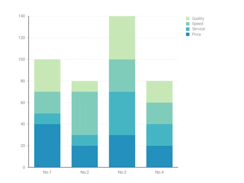
This is an example of Vizzlo's “Stacked Bar Chart”
Highlight the part-to-whole relationships of categories and compare various groups with this stacked bar graph.