Chart Vizzard
Vizzlo's AI-based chart generator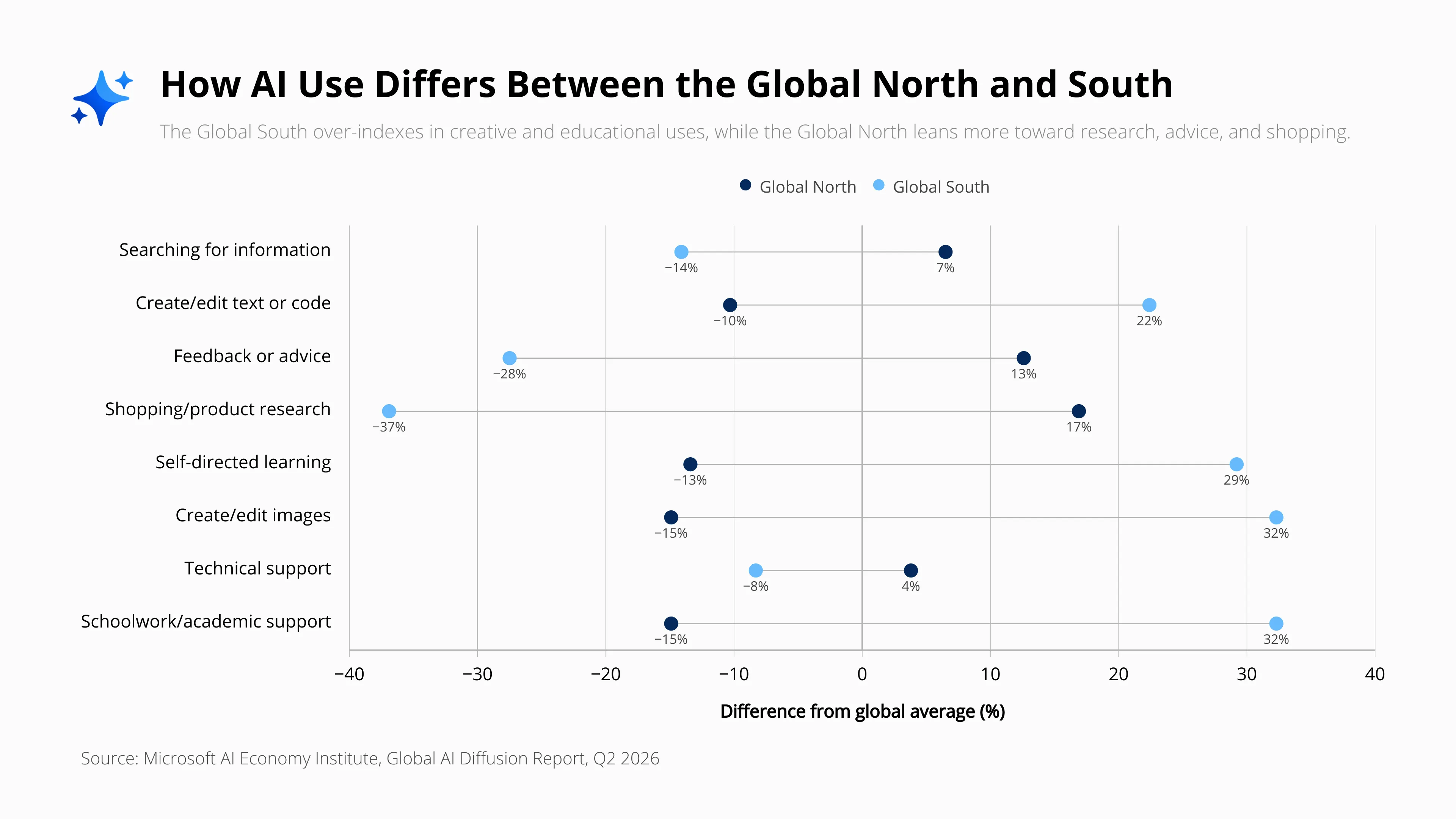
How AI Use Differs Between the Global North and South
How AI Use Differs Between the Global North and South is a range plot that compares how people in the Global North and Global South use AI across eight common activities, including information search, text and code creation, feedback and advice, shopping research, self-directed learning, image creation, technical support, and academic work. Rather than showing absolute usage levels, the chart measures how much each region over- or under-indexes relative to the global average.
The visualization reveals clear differences in how AI is used across regions. The Global North over-indexes in activities such as shopping and product research, feedback and advice, and searching for information. Shopping shows the widest gap, with the Global North 17% above the global average while the Global South is 37% below it.
By contrast, the Global South over-indexes strongly in creative and educational applications. Creating or editing images and schoolwork or academic support are both 32% above the global average, while self-directed learning is 29% above average and creating or editing text and code is 22% above average.
By connecting the values for both regions across each category, the range plot makes the size and direction of the differences immediately visible. Range plots are particularly useful for comparing two values across multiple categories, highlighting gaps between groups, and identifying where differences are largest.
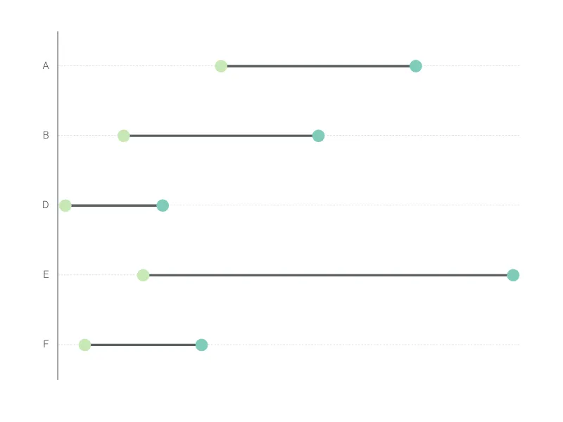
This is an example of Vizzlo's “Range Plot”
A range plot is a great choice if you want to highlight the difference between two values rather than the values itself.