Chart Vizzard
Vizzlo's AI-based chart generatorCircular Gauge
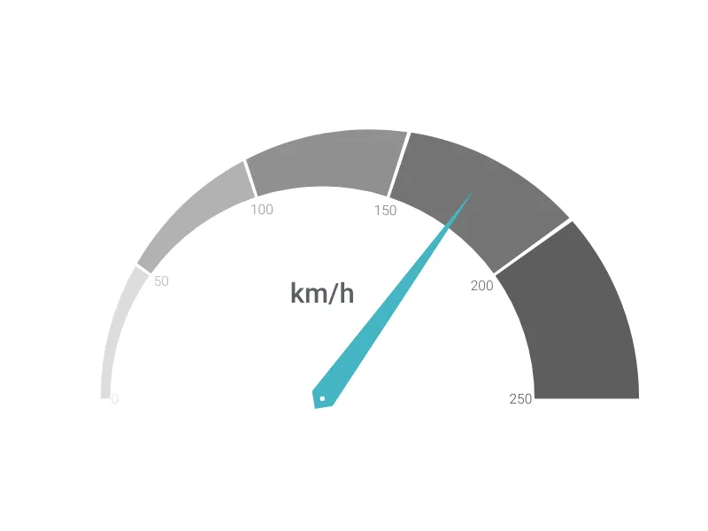
Tachometer-like gauge modeled after a typical car dashboard.
What is a circular gauge?
The Circular Gauge is a tachometer-style visualization perfect for displaying single metric values against a defined scale. This gauge chart mimics the appearance of automotive dashboard instruments, making it ideal for presenting performance indicators, progress metrics, or any measurement that benefits from an analog-style display.
Key Features
- Automotive-inspired design: Clean, professional gauge appearance similar to car dashboard instruments
- Customizable range: Set minimum and maximum values to define your measurement scale
- Current value indicator: Display the actual measured value with a prominent needle pointer
- Unit labeling: Add custom unit text (km/h, %, RPM, etc.) for clear context
- Number formatting: Configure precision, decimal marks, thousand separators, and prefix/suffix options
Best Use Cases
- Performance dashboards: KPI tracking, goal progress, efficiency metrics
- Monitoring systems: System health indicators, resource utilization, capacity planning
- Project management: Completion percentages, milestone tracking, budget utilization
- Quality metrics: Customer satisfaction scores, defect rates, compliance levels
- Financial indicators: Revenue targets, profit margins, growth rates
Configuration Options
The gauge can be fully customized through the sidebar settings:
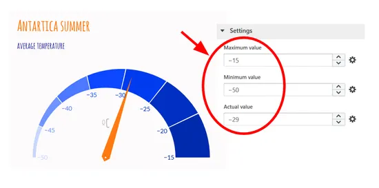
- Maximum/Minimum Values: Define the scale range for your measurement
- Current Value: Set the actual value to be displayed by the needle
- Unit Text: Add descriptive text to clarify what the gauge measures
- Number Formatting: Control decimal places, separators, and value display format
This visualization is particularly effective when you need to show how a current value relates to a possible range, making it immediately clear whether performance is within acceptable bounds or needs attention.
Circular Gauge: What's new?
The number inputs in the sidebar for setting up the maximum, minimum or actual values now each also accept negative numbers to visualize a circular gauge with values below 0.
Circular Gauge Alternatives

Enhance your productivity
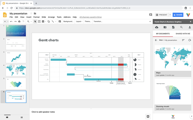
Create a Circular Gauge directly in the tools you love

Create a Circular Gauge in PowerPoint with
Vizzlo's add-in
Loved by professionals around the world


Visualizations your audience won’t forget
Convey abstract concepts and data with professionally designed
charts and graphics you can easily edit and customize.