Chart Vizzard
Vizzlo's AI-based chart generatorUp and Down Arrows
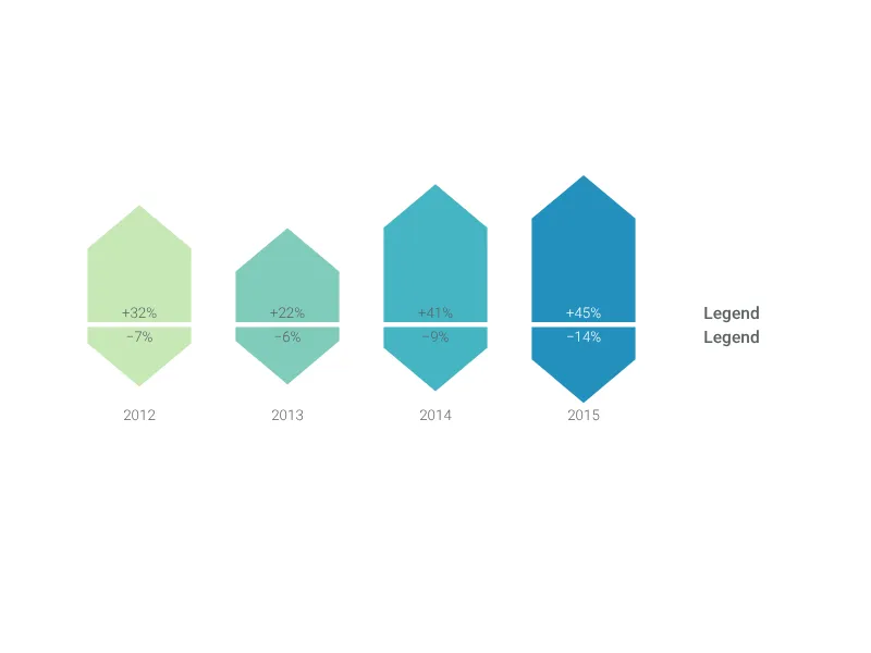
Compare different the growth and decline of multiple values with up to ten up pairs of arrow bars.
What is an up and down arrows chart?
The Up and Down Arrows chart provides a powerful visualization for comparing positive and negative values, growth and decline, or any data where directional change matters. This arrow-based design immediately communicates increases and decreases, making it perfect for financial reporting, performance analysis, or any scenario where showing both gains and losses is essential.
Key Features
- Directional clarity: Upward arrows for positive values, downward arrows for negative values
- Dual value comparison: Simultaneously display both positive and negative metrics
- Up to 10 data pairs: Comprehensive comparison across multiple categories or time periods
- Arrow width control: Adjustable arrow thickness (0-100%) for visual emphasis
- Comprehensive formatting: Full number formatting with precision, separators, and units
- Legend customization: Custom labels for upper (positive) and lower (negative) sections
- Professional presentation: Clean, executive-ready design for business presentations
Best Use Cases
- Financial reporting: Revenue gains versus losses, profit and loss analysis
- Performance metrics: Improvements versus declines in KPIs or operational metrics
- Market analysis: Growth versus contraction in different market segments
- Budget variance: Positive versus negative budget performance across departments
- Year-over-year comparison: Growth and decline trends across multiple periods
- Risk/reward analysis: Potential gains versus potential losses in decision scenarios
- Quality metrics: Improvements versus deterioration in quality measures
Configuration Options
Customize your arrow chart with precise controls:
- Arrow width: Percentage control (0-100%) for visual arrow thickness
- Legend labels: Custom text for positive (upper) and negative (lower) sections
- Value formatting: Precision, decimal marks, thousand separators, prefix/suffix options
- Data range: Support for values from -100 to +100 with professional formatting
Visual Communication Advantages
The arrow format provides immediate understanding:
- Directional intuition: Arrows naturally suggest movement up or down
- Magnitude clarity: Arrow length shows relative size of changes
- Comparative analysis: Easy to compare positive versus negative across categories
- Performance assessment: Quick identification of areas with gains versus losses
Professional Formatting
Advanced number formatting includes:
- Percentage display: Perfect for growth rates, efficiency changes, or variance analysis
- Currency formatting: Professional financial reporting with appropriate symbols
- Precision control: Adjustable decimal places for appropriate accuracy levels
- Sign handling: Automatic positive/negative formatting with customizable symbols
Strategic Applications
This visualization excels for:
- Executive dashboards: Quick performance overviews for leadership teams
- Variance reporting: Budget versus actual, planned versus achieved
- Trend analysis: Multi-period comparison of positive and negative changes
- Portfolio analysis: Investment gains versus losses across different holdings
Design Philosophy
The up and down arrow metaphor effectively communicates several key concepts:
- Directional momentum: Arrows suggest movement and change rather than static states
- Performance trajectory: Visual indication of whether things are improving or declining
- Balanced perspective: Equal weight given to both positive and negative performance
- Competitive analysis: Easy comparison of gains versus losses across multiple areas
Psychological Impact
Arrow visualizations create immediate emotional responses:
- Green upward arrows: Suggest success, growth, and positive momentum
- Red downward arrows: Indicate challenges, decline, or areas needing attention
- Balance assessment: Overall visual balance shows whether positives outweigh negatives
Professional Context
This chart type is particularly valuable in business contexts because:
- Honest reporting: Shows both successes and challenges transparently
- Actionable insights: Clearly identifies areas that need attention versus areas performing well
- Stakeholder communication: Provides balanced view for investors, management, or team members
- Performance monitoring: Tracks improvement and decline trends over time
Best Practices
For maximum effectiveness:
- Consistent scaling: Ensure arrow lengths accurately reflect magnitude differences
- Clear labeling: Use descriptive category labels that audience will understand
- Appropriate timeframes: Choose time periods that show meaningful change patterns
- Color coding: Leverage color psychology with green for positive, red for negative
The Up and Down Arrows chart transforms complex positive/negative data into immediately understandable visual comparisons that facilitate quick decision-making and clear communication about organizational performance and trends.
Up and Down Arrows: What's new?
Up and Down Arrows Alternatives
Use Cases
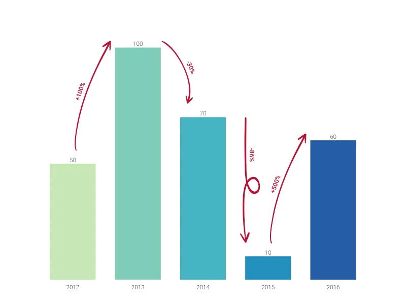
Bar & Column chartsEnhance your productivity
Create a Up and Down Arrows directly in the tools you love
Create a Up and Down Arrows in PowerPoint with
Vizzlo's add-in
Loved by professionals around the world


Visualizations your audience won’t forget
Convey abstract concepts and data with professionally designed
charts and graphics you can easily edit and customize.