Chart Vizzard
Vizzlo's AI-based chart generatorThermometer Chart
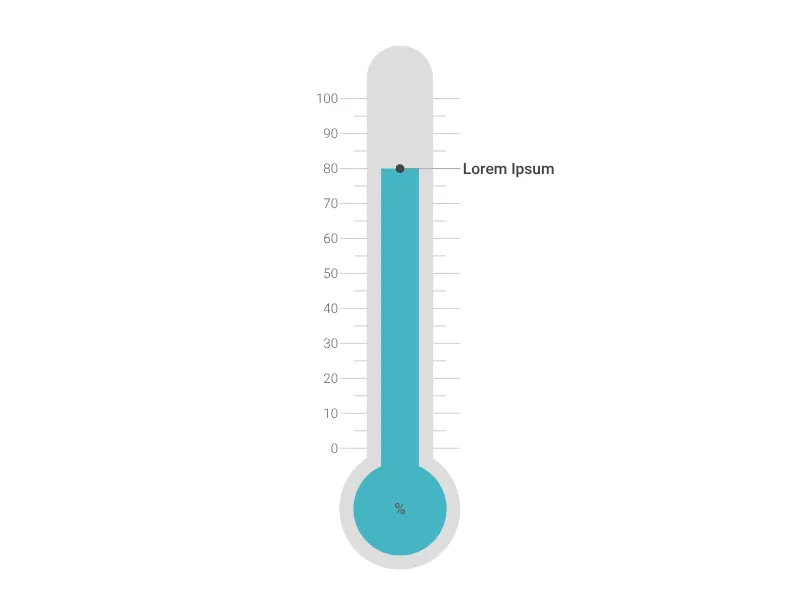
Use an illustrated thermometer to display any kind of single value.
What is a thermometer chart?
The Thermometer Chart provides an intuitive way to display single values using the familiar metaphor of a temperature gauge. This visualization is perfect for showing progress toward goals, performance levels, or any metric that benefits from the immediate recognition of “hot” versus “cold” states along a continuous scale.
Key Features
- Temperature metaphor: Universally understood thermometer design for instant recognition
- Single value display: Focus on one key metric without distraction
- Adjustable ratio: Precise slider control for setting the measurement level (0-100%)
- Custom scaling: Configurable minimum and maximum values for your specific range
- Rich text support: Customizable title, value label, and unit display
- Color customization: Adjustable thermometer color for branding or emphasis
- Scale formatting: Comprehensive number formatting options for professional presentation
Best Use Cases
- Goal tracking: Progress toward sales targets, fundraising goals, or project completion
- Performance monitoring: KPI dashboard displays, efficiency metrics, or quality scores
- Temperature displays: Actual temperature readings, market “heat,” or activity levels
- Capacity tracking: Resource utilization, storage capacity, or system load
- Health metrics: Patient monitoring, wellness tracking, or diagnostic indicators
- Market sentiment: Investment confidence, brand awareness, or customer satisfaction
- Achievement levels: Skill progression, certification progress, or competency development
Configuration Options
Customize your thermometer with detailed controls:
- Ratio setting: Precise percentage control for current value position
- Value display: Custom text for the measurement reading
- Title text: Descriptive label for what the thermometer measures
- Color selection: Custom thermometer color for visual emphasis or branding
- Scale configuration: Minimum/maximum values, precision, formatting, and axis labels
Visual Design Philosophy
The thermometer metaphor offers powerful communication advantages:
- Intuitive understanding: Everyone knows how thermometers work
- Immediate status: Quick visual assessment of current state
- Progress indication: Clear sense of how close to maximum or minimum
- Temperature associations: “Hot” suggests high performance, urgency, or intensity
- Medical credibility: Health-related associations suggest precision and monitoring
Scale Configuration
Advanced formatting options include:
- Number precision: Control decimal places for appropriate accuracy
- Unit display: Prefix and suffix options for currencies, percentages, or units
- Thousand separators: Professional formatting for large numbers
- Scale ranges: Custom minimum and maximum values for your specific context
Professional Applications
This visualization excels when you need to:
- Communicate urgency: High readings suggest immediate attention needed
- Show progress: Visual progress toward important organizational goals
- Monitor status: Quick health checks for systems, processes, or performance
- Create dashboard elements: Single-metric displays for executive dashboards
Psychological Impact
The thermometer design creates immediate emotional responses:
- Red zones: Suggest danger, maximum effort, or critical levels
- Green zones: Indicate safety, good performance, or acceptable ranges
- Rising mercury: Visual metaphor for increasing pressure, performance, or success
- Temperature extremes: Communicate urgency or exceptional performance
The Thermometer Chart transforms abstract metrics into immediately recognizable visual indicators that audiences can process instantly, making it perfect for situations where quick understanding and emotional response are essential.
Thermometer Chart: What's new?
Thermometer Chart Alternatives
Enhance your productivity
Create a Thermometer Chart directly in the tools you love
Create a Thermometer Chart in PowerPoint with
Vizzlo's add-in
Loved by professionals around the world


Visualizations your audience won’t forget
Convey abstract concepts and data with professionally designed
charts and graphics you can easily edit and customize.