Chart Vizzard
Vizzlo's AI-based chart generatorOnion Chart
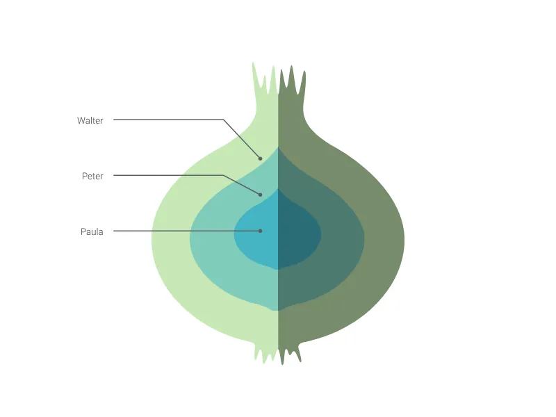
Create your onion diagram with multiple layers of your projects' dependencies.
What is an onion chart?
The Onion Chart uses the familiar metaphor of layered onion rings to visualize complex systems with multiple interdependent layers. This elegant visualization is perfect for showing how different components, dependencies, or organizational levels relate to each other in a nested, hierarchical structure.
Key Features
- Layered visualization: Up to 7 concentric layers representing system components
- Nested relationships: Clear visual representation of how elements contain or depend on others
- Simple labeling: Each layer includes descriptive text for clear identification
- Organic metaphor: Familiar onion structure makes complex relationships accessible
- Scalable design: Accommodates various levels of system complexity
Best Use Cases
- System architecture: Display application layers from core services to user interfaces
- Organizational structure: Show nested teams, departments, or reporting relationships
- Project dependencies: Visualize how different project components rely on each other
- Software architecture: Represent microservices, APIs, and infrastructure layers
- Security models: Show defense-in-depth strategies with multiple protection layers
- Market analysis: Display market segments from niche to broad audiences
- Problem analysis: Break down complex issues into underlying component layers
Configuration Options
The onion chart focuses on simplicity with essential customization:
- Layer labels: Descriptive text for each concentric ring
- Layer quantity: Flexible support for 1-7 layers based on system complexity
Design Philosophy
The onion metaphor effectively communicates several important concepts:
- Nested dependencies: Inner layers support or enable outer layers
- Core protection: Most critical elements are protected at the center
- Layered complexity: Each ring adds functionality or capability
- Natural boundaries: Clear separation between different system levels
- Gradual exposure: Moving from inside out reveals increasing complexity
Visual Advantages
The concentric ring structure provides immediate understanding:
- Intuitive hierarchy: Everyone understands onion layer relationships
- Containment clarity: Obvious which elements contain others
- Dependency flow: Visual representation of how changes propagate outward
- System boundaries: Clear delineation between different functional areas
Professional Applications
This visualization excels in scenarios requiring:
- Architecture documentation: Clear system structure communication
- Dependency mapping: Understanding how components interact
- Risk assessment: Identifying which layers are most critical
- Design planning: Organizing complex systems into manageable layers
The Onion Chart transforms abstract system relationships into concrete, understandable visual structures that both technical and non-technical audiences can quickly grasp and remember.
Onion Chart: What's new?
Onion Chart Alternatives
Enhance your productivity
Create a Onion Chart directly in the tools you love
Create a Onion Chart in PowerPoint with
Vizzlo's add-in
Loved by professionals around the world


Visualizations your audience won’t forget
Convey abstract concepts and data with professionally designed
charts and graphics you can easily edit and customize.