Chart Vizzard
Vizzlos KI-basierter Diagramm-GeneratorSpirit Airlines: Financial Path to Shut Down
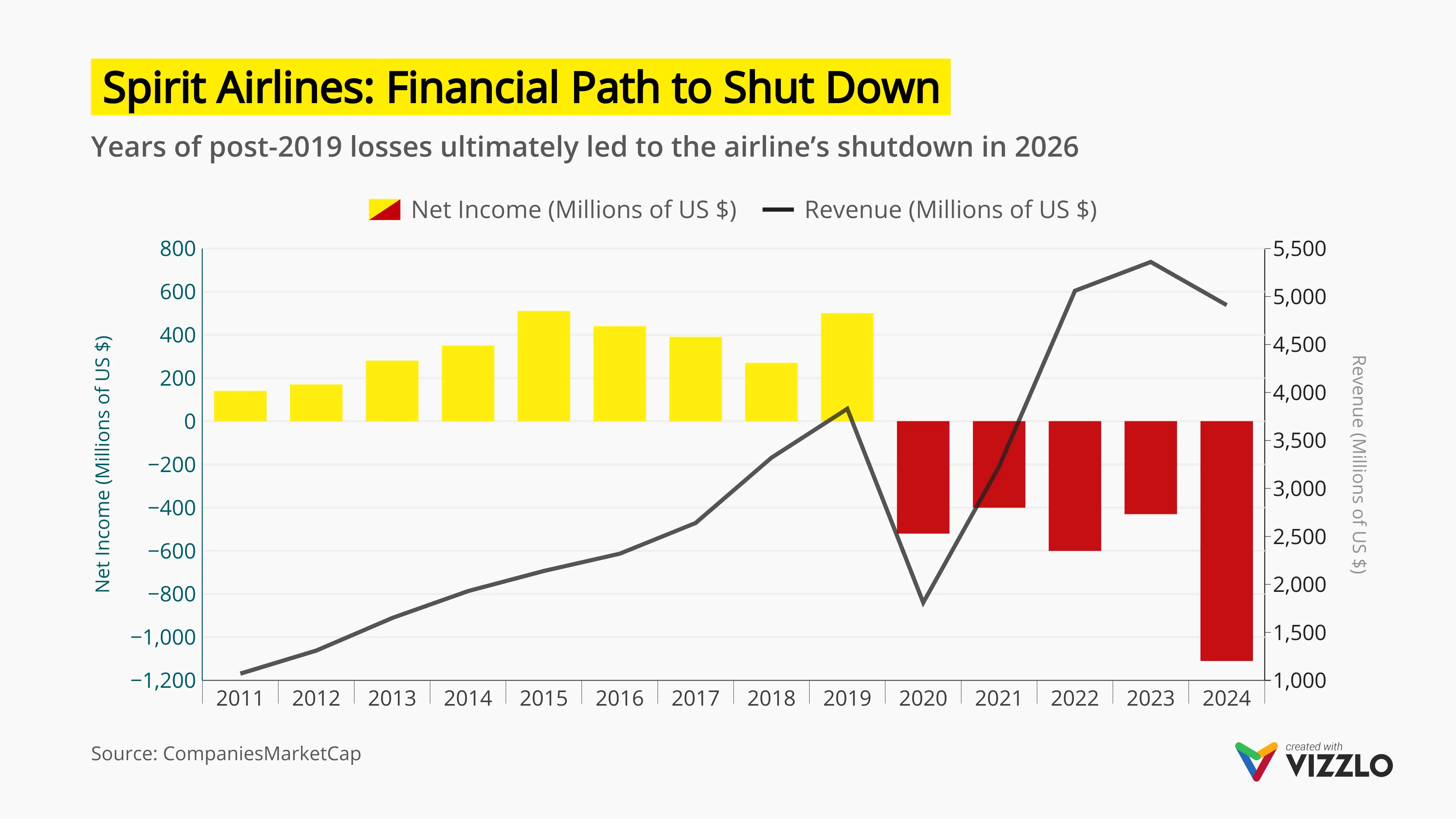
This chart visualizes Spirit Airlines’ financial performance from 2011 to 2024, highlighting the transition from consistent profitability to sustained losses. It shows how net income turned negative after 2019, while revenue—despite recovering after the COVID-19 downturn—was not enough to offset rising operating costs and structural pressures.
The visualization clearly captures the post-pandemic financial strain, ongoing losses, and the weakening of the ultra low-cost business model, ultimately leading to the airline’s shutdown in 2026. The combination of bar and line chart formats allows for an intuitive comparison between profitability and revenue trends over time.
Designed for data storytelling and business presentations, this example demonstrates how to communicate financial decline, corporate performance trends, and industry disruption using clean, structured visuals. It is particularly relevant for topics such as airline industry analysis, financial performance tracking, time series data visualization, cost vs revenue dynamics, and market exit scenarios.
This chart showcases how complex financial data can be transformed into clear, professional visuals for consulting, investor reports, strategy discussions, and KPI dashboards.
Dies ist ein Beispiel für Vizzlos "Zeitreihendiagramm"
Komplexes Zeitreihendiagramm zur Visualisierung detaillierter Finanzdaten.
Finanzen & Wirtschaft Balken- & Säulendiagramme Linien- & Flächendiagramme Zeitbasierte Diagramme