Chart Vizzard
Vizzlos KI-basierter Diagramm-Generator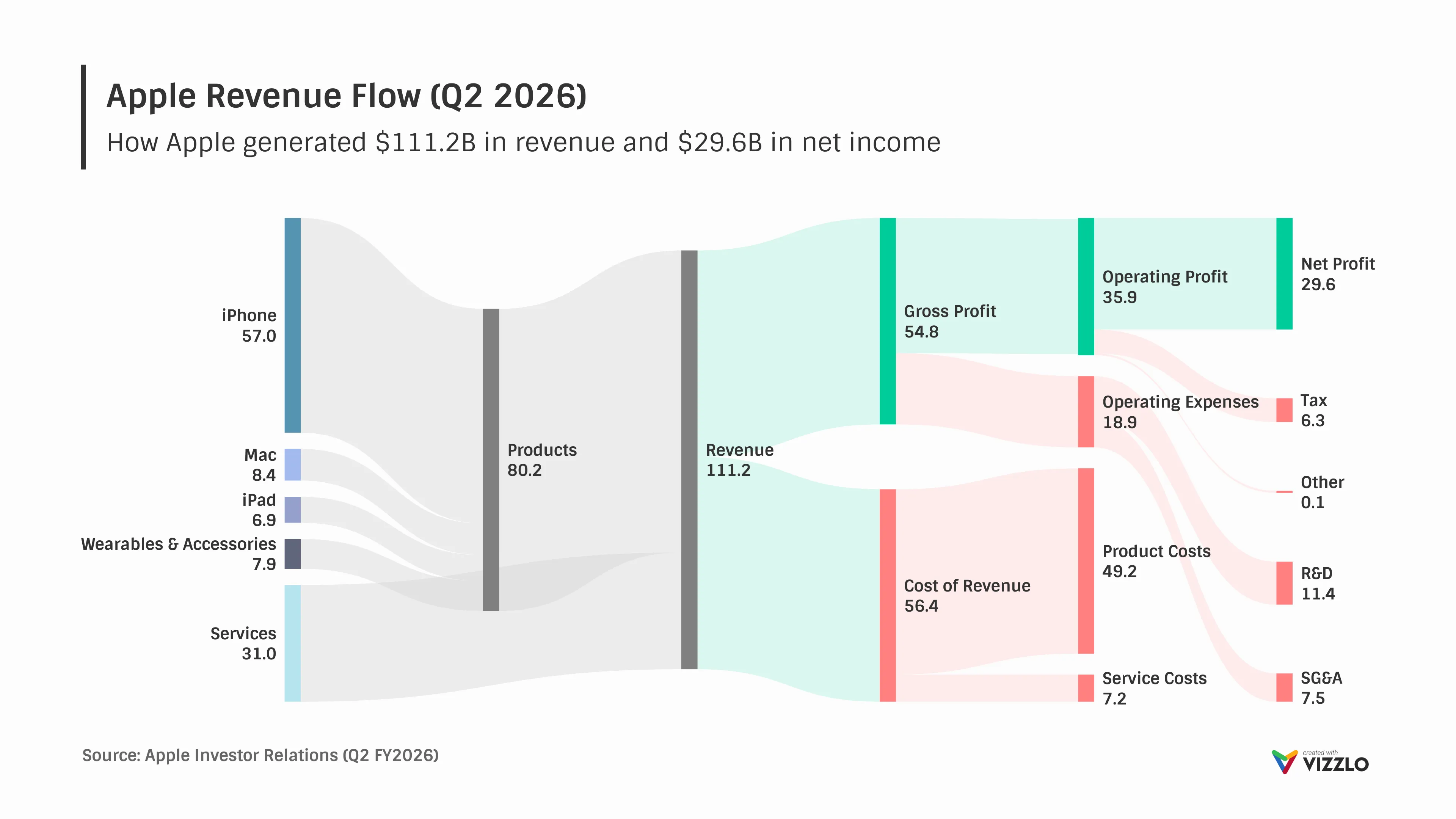
Apple Revenue Flow (Q2 2026)
Apple Revenue Flow (Q2 2026) is a Sankey diagram that visualizes how Apple generated $111.2 billion in revenue during the second quarter of fiscal year 2026 and how that revenue flowed through costs, operating expenses, and ultimately to $29.6 billion in net income. The chart highlights the contribution of each major product category—including iPhone, Mac, iPad, Wearables & Accessories, and Services—and shows how product and service sales combine to form Apple’s total revenue.
The visualization reveals the structure of Apple’s income statement, illustrating how revenue is allocated between cost of sales and gross margin before flowing into operating expenses, taxes, and net income. It also highlights the importance of Services as a growing revenue stream and the iPhone as Apple’s largest source of revenue.
Using proportional flows to represent financial data, the Sankey diagram makes it easy to follow the movement of money through each stage of the business. It is well suited for visualizing financial statements, budgets, energy flows, supply chains, and other processes where quantities move from one stage to another.
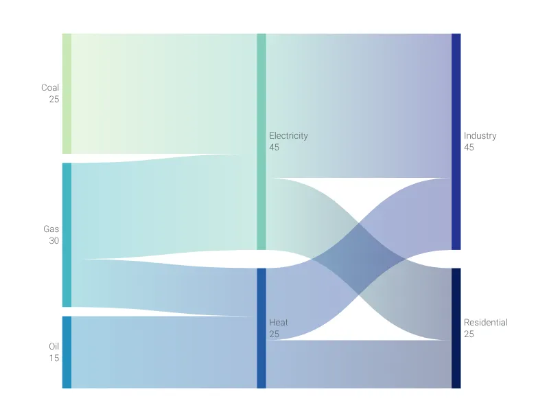
Dies ist ein Beispiel für Vizzlos "Sankey-Diagramm"
Visualisieren Sie Flüsse und Mengen zwischen Knoten mit proportional breiten Bändern. Ideal für Energieflüsse, Budgetverteilungen und Prozessanalysen.