Chart Vizzard
Vizzlos KI-basierter Diagramm-Generator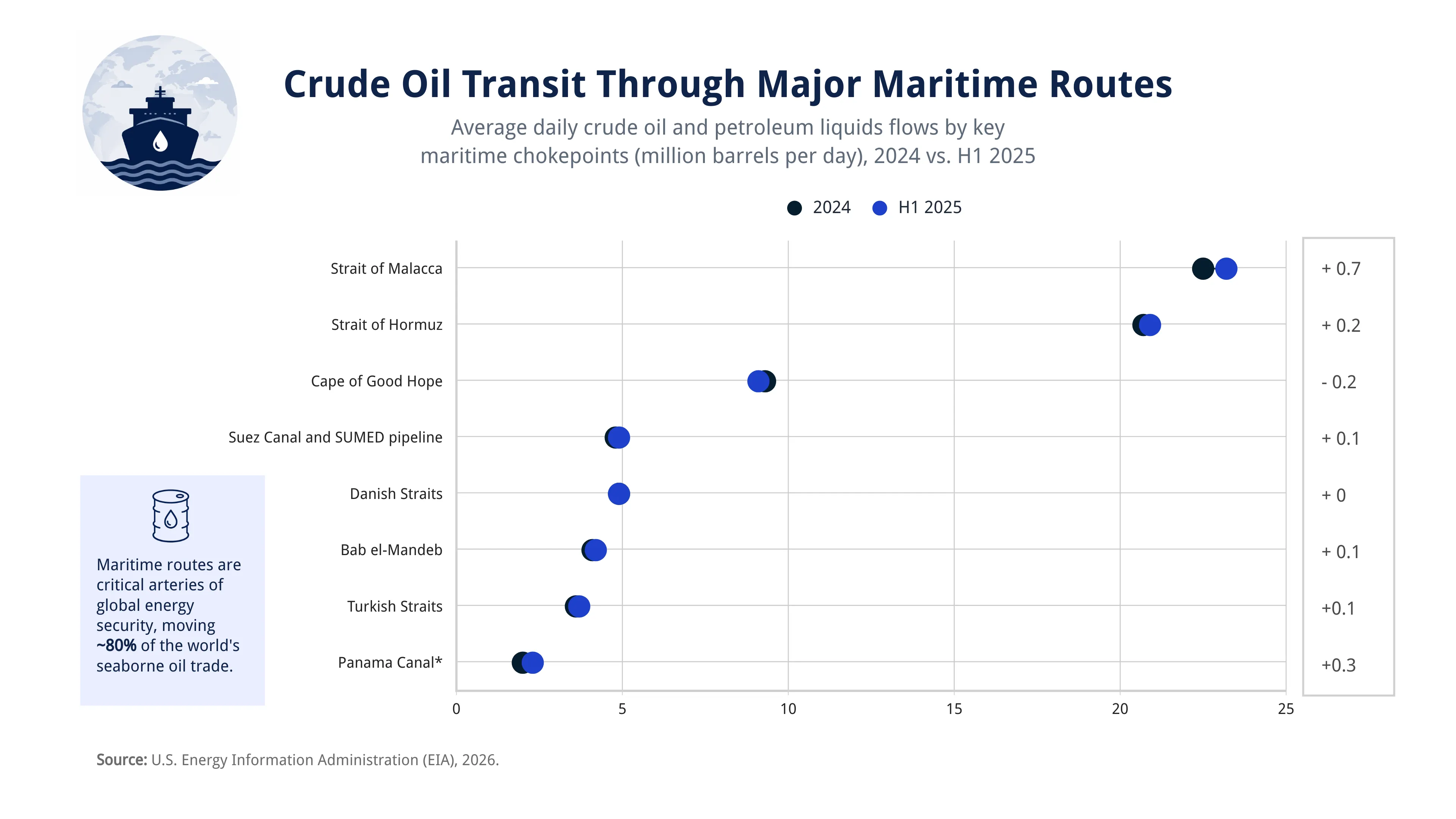
Crude Oil Transit Through Major Maritime Routes
This range plot compares the average daily volume of crude oil and petroleum liquids transported through the world’s major maritime oil routes in 2024 and the first half of 2025. Each route is represented by two connected markers, making it easy to identify changes in transit volumes over time.
The visualization highlights that global oil flows remained broadly stable across key maritime chokepoints, with the Strait of Malacca continuing to be the world’s busiest oil shipping route, followed by the Strait of Hormuz. While most routes experienced only minor changes, the Panama Canal recorded the largest increase, whereas transit around the Cape of Good Hope declined slightly.
By connecting values for each period, the range plot emphasizes both the magnitude and direction of change while allowing readers to compare the relative importance of strategic maritime routes that underpin global energy trade.
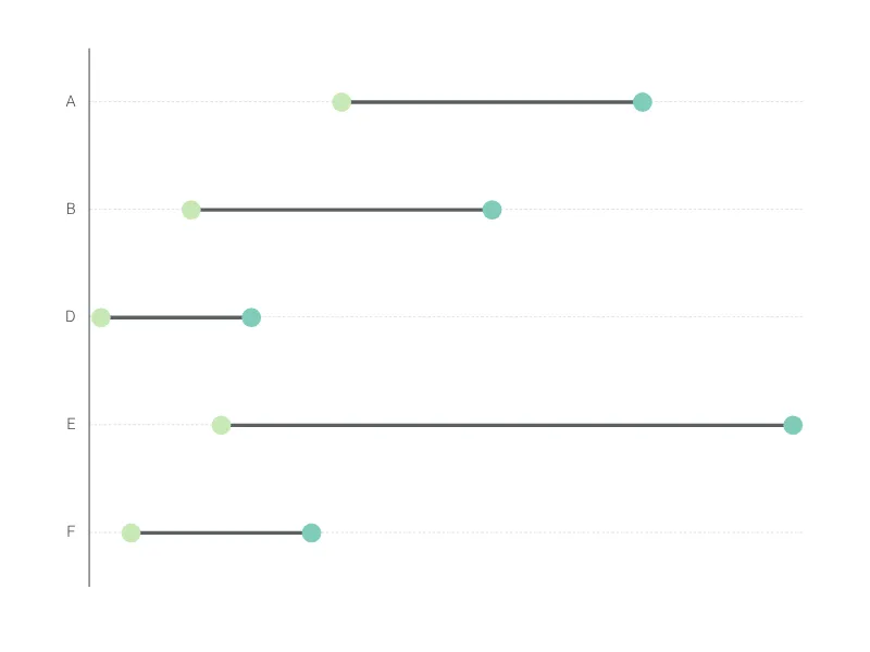
Dies ist ein Beispiel für Vizzlos "Spannweitendiagramm"
Ein Spannweitendiagramm ist die richtige Wahl, wenn Sie den Unterschied zwischen zwei Werten statt der Werte selbst hervorheben möchten.