Chart Vizzard
Vizzlos KI-basierter Diagramm-GeneratorApple's Market Cap Evolution
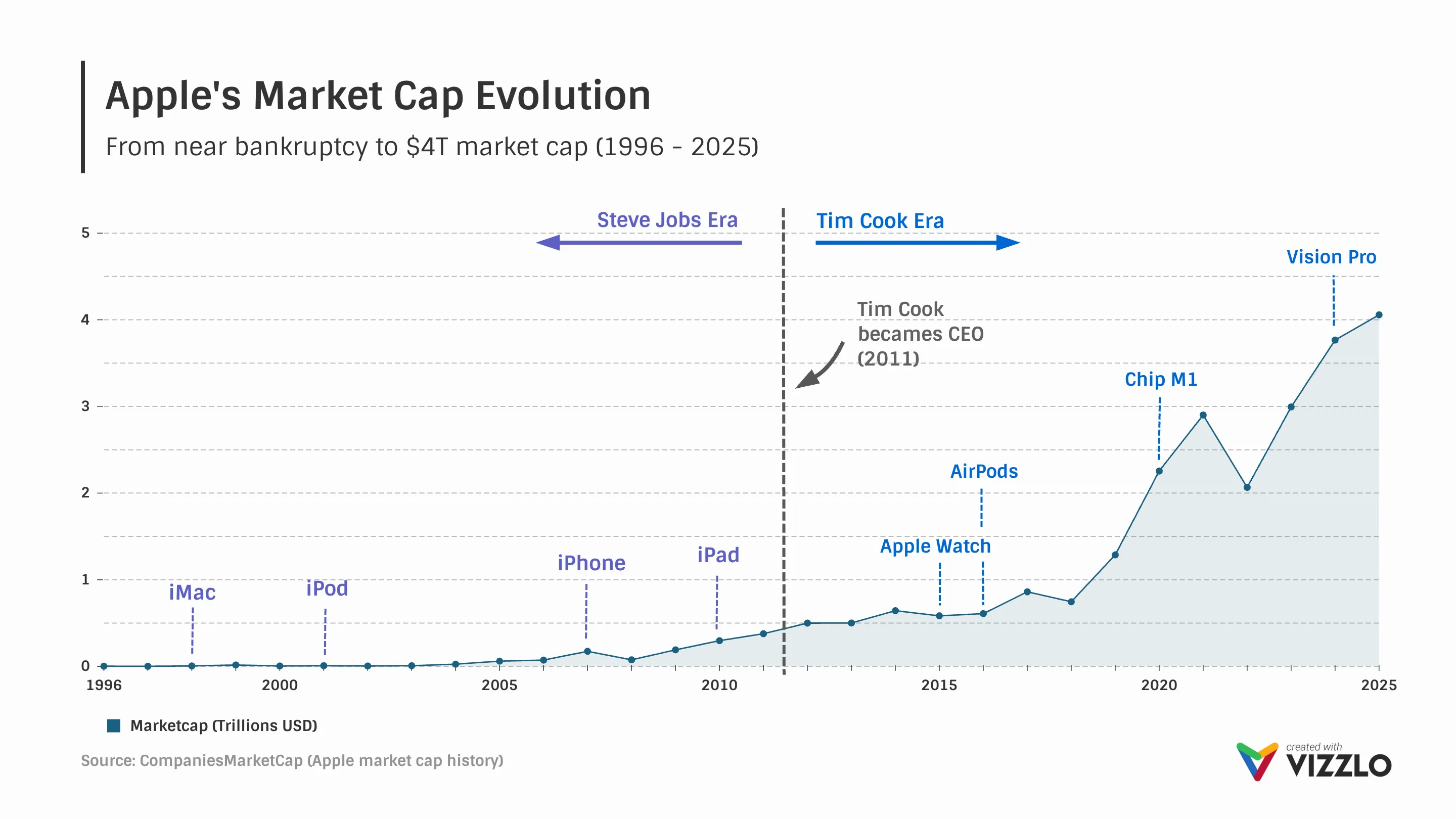
This line chart shows Apple’s market capitalization growth from near-bankruptcy in 1996 to over $4 trillion in 2025. It highlights key product launches such as the iMac, iPod, iPhone, iPad, Apple Watch, AirPods, M1 chip, and Vision Pro, illustrating how innovation has driven long-term value creation.
The visualization also contrasts leadership eras, from Steve Jobs’ turnaround phase to Tim Cook’s period of global scale and sustained growth. Clear annotations and a structured timeline make it easy to connect product milestones with shifts in company valuation.
A strong example for presentations, investor reports, and business storytelling, especially when explaining tech industry trends, stock market growth, corporate strategy, and product-led expansion. Ideal for use cases involving time series data, financial performance tracking, KPI visualization, and data storytelling with clean, professional design.
Dies ist ein Beispiel für Vizzlos "Liniendiagramm"
Ein einfacher, schneller und vielseitiger Liniendiagramm-Editor.